
Q2 - 2026 Wrap Up
From Turbulence to Record Highs
If the first quarter tested investors' resolve, the second quarter rewarded it. After entering April still digesting the conflict between the United States and Iran, elevated oil prices, and renewed inflation concerns, U.S. equities staged a powerful second-quarter advance. The S&P 500 rallied roughly 15%, recovering the first quarter's losses in full and closing June at record highs. The rally that began with a handful of large technology companies broadened meaningfully by quarter's end, with small-cap, mid-cap, equal-weight, and value benchmarks all reaching new records.
Beneath the headline strength, the quarter carried genuine cross-currents: a new Federal Reserve Chairman with a decidedly hawkish message, inflation that refuses to return to target, a contraction in global money supply, and a June pullback in the very technology names that led the initial advance. Each of these developments fits squarely within the framework we outlined last quarter: a market environment defined less by clean, durable trends and more by sharp rotations, shorter cycles, and wider swings. Below, we examine the quarter's key developments through that lens.
Fundamental Landscape
A New Hand at the Fed
Arguably, the most consequential development of the quarter occurred not in the markets, but in Washington. In May, following a contentious Senate confirmation, Kevin Warsh was sworn in as Chairman of the Federal Reserve. His arrival marked an immediate and unmistakable shift in tone. At his first FOMC meeting in June, Chairman Warsh struck a more hawkish posture than markets anticipated, refocusing the central bank squarely on its 2% inflation mandate and acknowledging, in unusually blunt terms, that the Fed bears responsibility for underestimating the inflation threat of the past five years.
The bond market took notice. Consider how far expectations have traveled: in January, futures markets were pricing in two rate cuts by year-end. By the close of the second quarter, they were pricing in two rate hikes, a full percentage-point swing in expectations in six months. The June dot plot showed half of the committee penciling in higher rates for 2026.
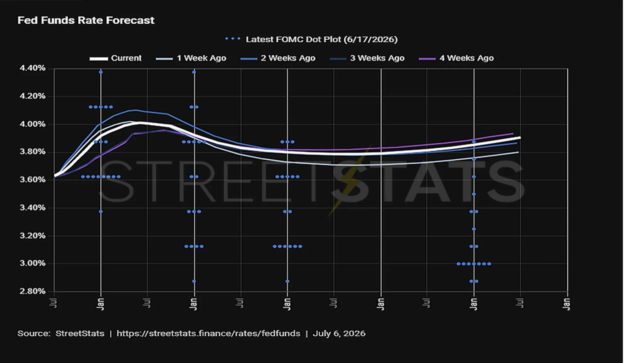
Fed funds rate forecast with the latest FOMC dot plot (June 17, 2026). Source: StreetStats, as of July 6, 2026.
The data gave the new Chairman ample justification. Core PCE, the Fed's preferred inflation gauge, rose for a third consecutive month to 3.4% in May, well above target, as the energy price shock from the first quarter's Middle East escalation worked its way through the broader economy. For readers of our recent letters, this should sound familiar. We have argued that the post-COVID inflation shock was unlikely to resolve in a straight line, and that the structural forces at work—elevated government debt, fiscal deficits near $2 trillion, and geopolitical strain—point toward inflation that proves more persistent and interest rates that remain structurally higher than those of the prior decade. The second quarter offered further confirmation.
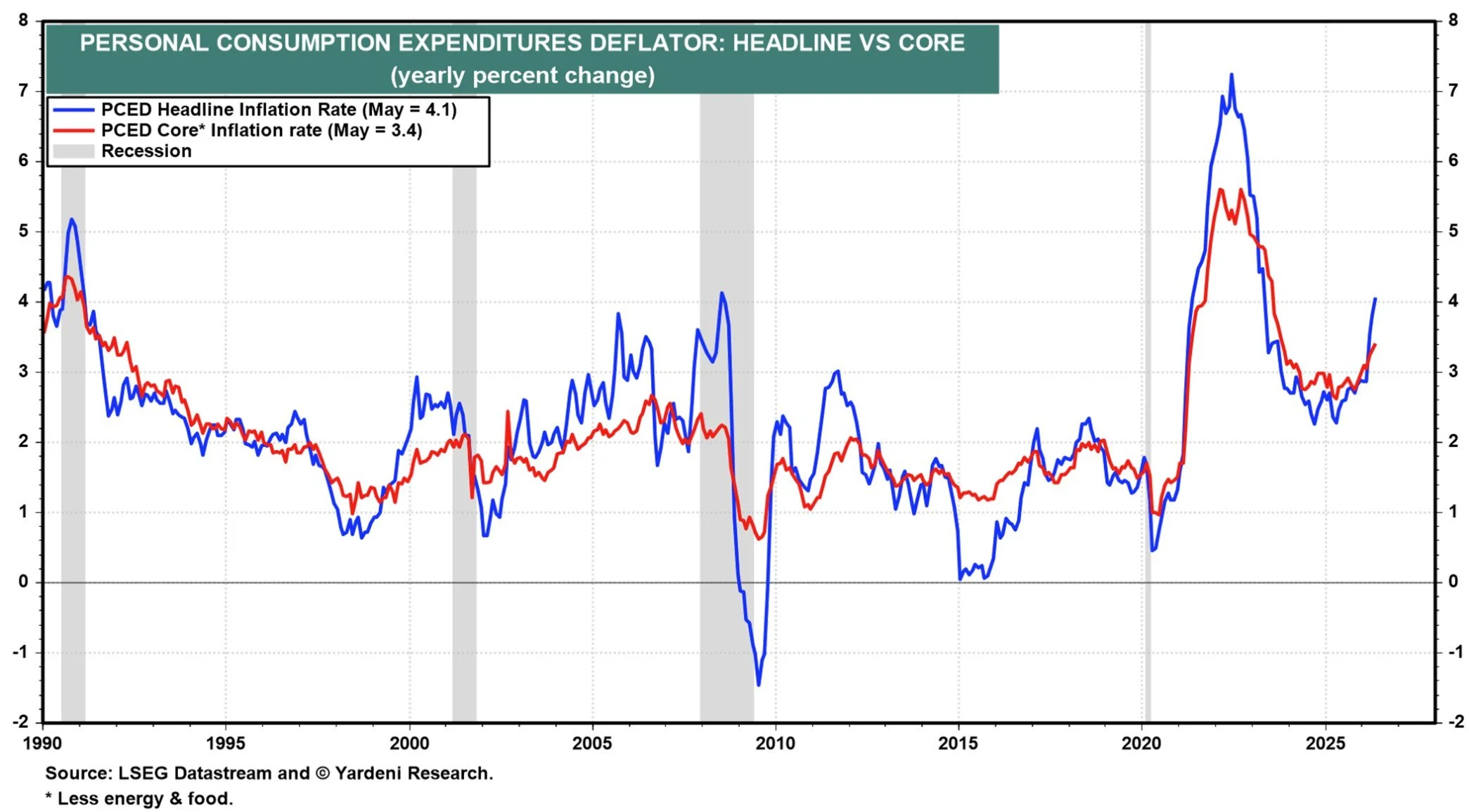
Personal consumption expenditures deflator, headline vs. core, yearly percent change. Source: Yardeni Research and LSEG Datastream.
Central Bank Balance Sheet
The great post-pandemic unwind has reached an inflection point and 2026 is the year it will be decided. Between 2022 and late 2025, the Federal Reserve allowed roughly $2.5 trillion in bonds to roll off its balance sheet, shrinking it from a peak near $9 trillion to about $6.5 trillion. That process ended abruptly in December, when stress in overnight funding markets (short-term borrowing rates spiking as bank reserves grew scarce) forced the Fed to halt the runoff and begin purchasing $40 billion of Treasury bills per month through mid-April to stabilize the system. The balance sheet has since found a floor near $6.7 trillion and ended the quarter modestly higher than a year ago. Abroad, the picture is mixed: the European Central Bank's holdings have resumed their decline to $6.8 trillion; the Bank of Japan continues its retreat at $3.9 trillion, and only the People's Bank of China, at $7.1 trillion, is still expanding.
That pause, however, is unlikely to be the final word. At his first meeting in June, Chairman Warsh launched a formal review of the balance sheet's size and structure, a signal that the portfolio, which he has long criticized as blurring the line between monetary and fiscal policy, is now an active policy question. Treasury Secretary Bessent has publicly endorsed a leaner balance sheet as well. Warsh has been careful to set expectations, noting recently that a process eighteen years in the making will take years rather than months to reverse, and internal resistance is real: shrinking too quickly risks repeating the funding squeezes of 2019 and late 2025. But the direction of travel is clear. Market observers expect the Fed to resume reduction as early as the fourth quarter, most likely by accelerating the runoff of its roughly $2 trillion in mortgage-backed securities.
For markets, the sequence matters more than the level. The halt to quantitative tightening in December—paired with those temporary bill purchases—amounted to a quiet liquidity injection, and it is no coincidence that risk assets rallied powerfully in the months that followed. That support lapsed in April. The policy bias for the balance of 2026 and into 2027 now points toward renewed withdrawal, not renewed accommodation, meaning the tailwind that helped carry this market to record highs has expired, and the review now underway will determine how stiff the coming headwind becomes.
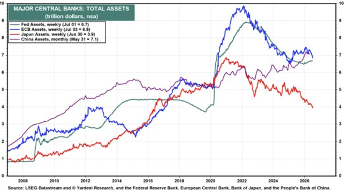
Total assets of the Federal Reserve, European Central Bank, Bank of Japan, and People’s Bank of China, in trillions of dollars. Source: Yardeni Research and LSEG Datastream, as of early July 2026.
The Rising Dollar: A Quiet Form of Tightening
An additional force draining global liquidity is the U.S. dollar itself. After spending most of 2025 in retreat, the Dollar Index has turned higher, reclaiming the 100 level and rising along the multi-year uptrend line that has defined its advance since 2021. The driver is no mystery: as markets repriced from rate cuts to rate hikes, capital flowed toward the world's highest-quality yield.
A strengthening dollar tightens financial conditions worldwide in ways that are easy to overlook. Because the dollar is the world's funding currency, a meaningful share of global debt is borrowed in dollars, so every uptick in the index raises the real burden of repayment for borrowers abroad. It also mechanically shrinks the dollar value of money supplies in Europe, Japan, and China, feeding directly into the global M2 measure discussed below. Historically, sustained periods of dollar strength have coincided with pressure on risk assets, commodities, and emerging markets alike.
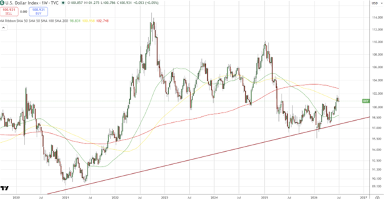
U.S. Dollar Index (DXY), weekly, with 50-, 100-, and 200-week moving averages. Source: TradingView.com.
Global M2: The Indicator to Watch
Long-time readers know that we regard liquidity as the single most important driver of asset prices. Global M2 money supply—the combined total of cash, deposits, and readily accessible money across the world's major economies—is the broadest available measure of that liquidity, and its relationship with equity markets over the past decade has been remarkably tight. As the chart below illustrates, the S&P 500 has tracked the expansion and contraction of global M2 with a lag of approximately three months: when the money supply grows, equities tend to follow it higher a quarter later, and when it contracts, equities tend to stall or decline on a similar delay.
That relationship is precisely why the most recent reading commands our attention. After climbing steadily to a peak above $105 trillion, global M2 has rolled over, with the latest reading declining to about $101.7 trillion. The drivers are consistent with everything discussed above: a hawkish new Fed Chairman, fading rate-cut expectations, ongoing balance sheet reduction, and a rising dollar—which mechanically shrinks the dollar value of money supplies abroad. If the three-month lag relationship holds, the recent contraction in global liquidity suggests equity markets will face a meaningful headwind in the months ahead. No single indicator is infallible, but this is the one we will be watching most closely through the second half, and it is a central input to our more cautious positioning.
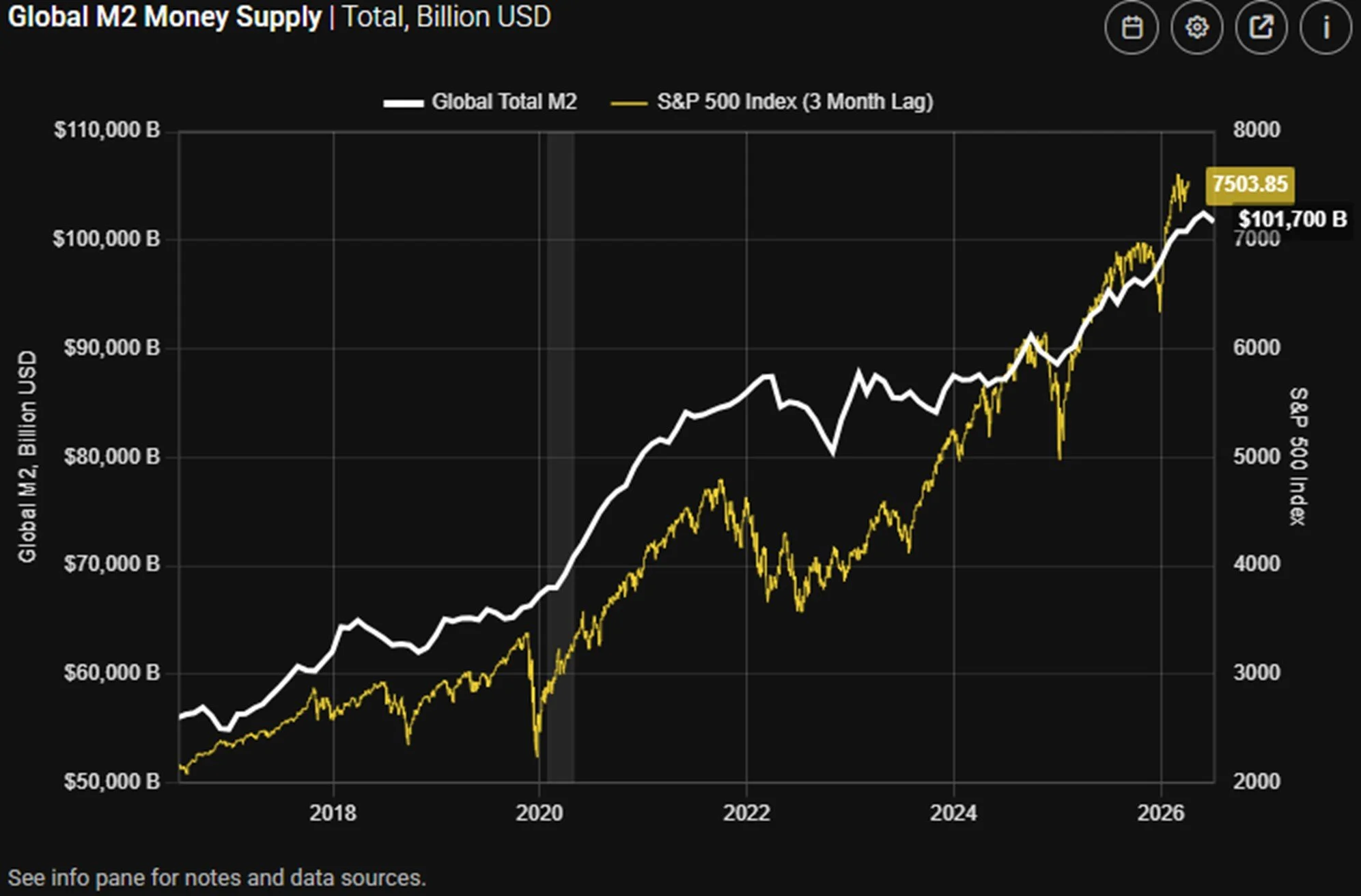
Global M2 money supply vs. the S&P 500, plotted on a 3-month lag. Source: StreetStats.
Valuations: The Case for Small and Mid-Caps
Valuation rarely tells you when a market will turn, but it reliably tells you how much room you have for error. Today, that margin of safety differs starkly across the market. The S&P 500 trades at 20.3 times forward earnings—above both its 5-year and 10-year averages, and a level reached in the past 25 years only during the dot-com era and the post-COVID surge. Mid- and small-cap stocks, by contrast, trade at 16.3 and 16.0 times forward earnings respectively, essentially in line with their long-run historical averages. In other words, an investor today pays a premium of roughly 25% to own large caps relative to smaller companies, historically a wide gap.
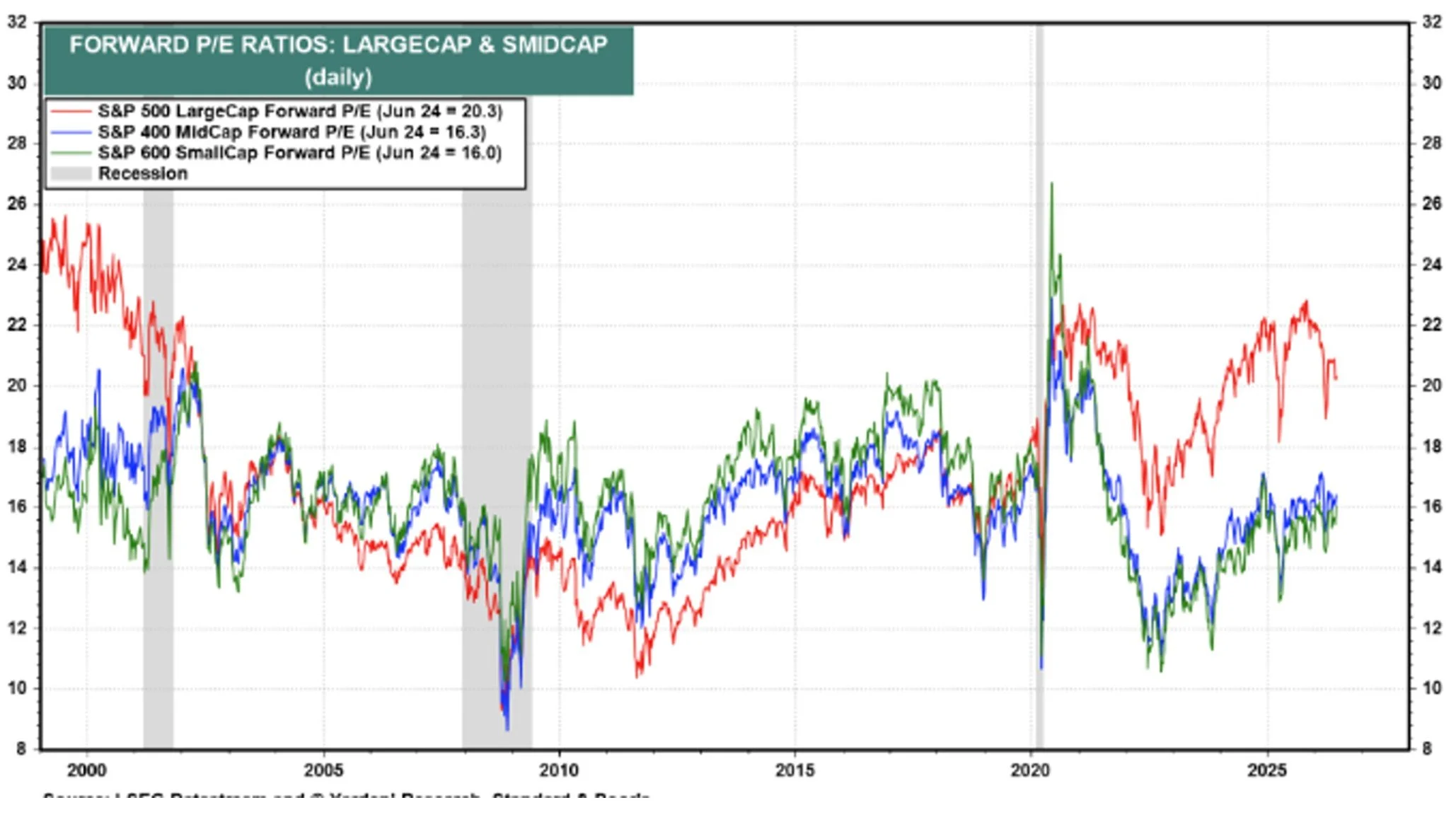
Forward P/E ratios: S&P 500 large cap vs. S&P 400 mid cap and S&P 600 small cap. Source: Yardeni Research and LSEG Datastream, as of June 24, 2026.
The longer-horizon picture is more sobering still. The Shiller P/E—which smooths earnings over ten years to strip out cyclical noise—now stands 125% above its 150-year arithmetic mean of roughly 17.7, approaching three standard deviations from trend. In the entire history of the measure, only the peak of the dot-com bubble in 2000 registered a more extreme reading. We do not cite this as a timing tool; markets sustained elevated Shiller readings for years in the late 1990s and again in the past decade. But valuations at these extremes have historically been followed by a decade of below-average large-cap returns, and they leave the most expensive corner of the market acutely vulnerable to any disappointment in the earnings or liquidity picture.
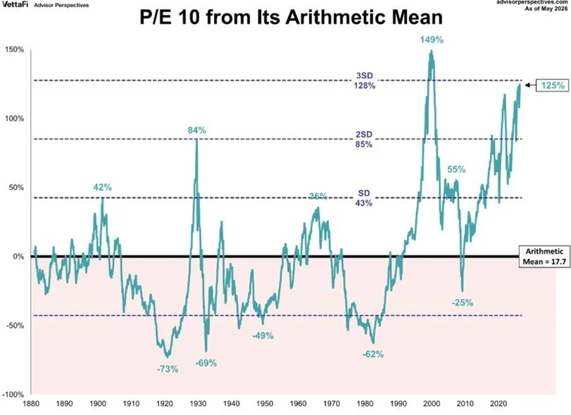
Shiller P/E (P/E 10), percentage deviation from its arithmetic mean. Source: Advisor Perspectives / VettaFi, as of May 2026.
Technical Landscape
The technical picture reinforces the fundamental one: a long-term uptrend that remains intact—the market is above its long-term trendline and the operative pattern is still one of higher highs and higher lows—but one that is stretched, leveraged, and increasingly dependent on a liquidity backdrop that is turning less friendly. Three developments stand out.
Margin Debt: Leverage at the Highs
Margin debt, money investors borrow against their portfolios to buy more stock, has climbed to roughly $1.4 trillion, well above its long-term trendline. History counsels attention here. As the chart below shows, the prior peaks in margin debt relative to trend arrived in March 2000, July 2007, and late 2021—each within months of a major market top. The mechanism is straightforward: leverage amplifies gains on the way up, but when prices fall, margin calls force investors to sell into weakness, turning ordinary corrections into cascades. Elevated margin debt does not cause a decline, but it determines how disorderly one becomes.
Corroborating signals accompany the leverage. The VIX—the market's gauge of expected volatility—sits in the low-to-mid teens, a level that historically reflects complacency rather than confidence. Sentiment surveys show bulls outnumbering bears, and momentum readings are overbought, with money-flow indicators beginning to diverge from price as the market makes new highs on fading internal strength. Individually, each of these is unremarkable; together, they describe a market that has priced in a great deal of good news and little of the bad.
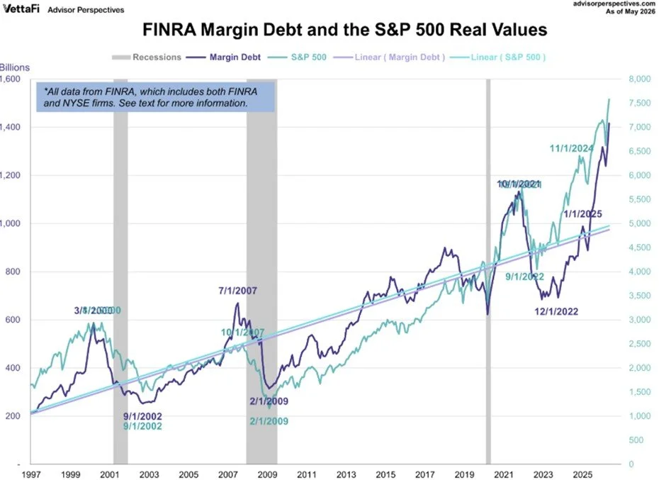
FINRA margin debt and the S&P 500, inflation-adjusted, with long-term trendlines. Source: Advisor Perspectives / VettaFi, as of May 2026.
Stretched Above the Moving Averages
A second measure of extension comes from the market's distance above its own long-term moving averages (the smooth trendlines that track where prices have traveled over the prior one to four years). On a weekly basis, the S&P 500 currently sits about 8% above its 50-week moving average, 16% above its 100-week, and a striking 36% above its 200-week average. Markets oscillate around these lines over time; the further price stretches above them, the stronger the eventual gravitational pull back toward—or below—trend.
Extension of this magnitude is not a sell signal in itself; strong bull markets routinely trade above their averages for extended periods. But it does define the risk asymmetry. A reversion to the 50-week average from current levels would represent a decline of approximately 7-8%; a retreat to the 100-week, about 14%. Neither would break the long-term uptrend and both would feel severe to investors who have grown accustomed to a market that only rises.
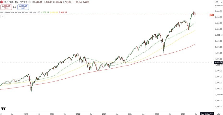
S&P 500, weekly, with 50-, 100-, and 200-week moving averages. Source: TradingView.com.
The Liquidity Tightening Cycle of 2026–2027
The third and most important technical consideration is where we sit within the liquidity cycle itself, the recurring expansion and contraction of money and credit that we have described in prior letters. The easing phase that began in late 2023, which powered three consecutive years of double-digit equity returns, is now mature. The evidence of its rollover is accumulating on every front: a new Fed Chairman openly reviewing the balance sheet with a bias toward restraint, futures markets pricing hikes rather than cuts, real yields that remain restrictive, a rising dollar draining liquidity from the global system, and—most directly—the contraction in global M2 discussed above.
Our cycle work places this market in late-stage territory, and we expect 2026 and 2027 to be defined by tightening rather than easing. There is an added complication: the federal government must refinance trillions of dollars of maturing debt over precisely this window, competing for capital in a market where the central bank is no longer a reliable buyer. Periods like this do not preclude further gains, but they are the environment in which drawdowns begin, and they historically reward investors who de-risk early over those who attempt to time the exact top. When the liquidity tide is rising, we want maximum exposure to it; when it begins to recede, as it now appears to be doing, we want to be positioned before the crowd notices.
Conclusion: A Time for Caution, Not Exit
Weighing the evidence, our conclusion is straightforward: the risk-reward of chasing this rally has deteriorated. Valuations are stretched, liquidity is tightening, sentiment is complacent, and the cycle is old. None of these conditions guarantees an imminent decline, but together they argue that the easy gains of this advance are behind us, and that the prudent course is to carry less risk into the second half than we carried into the first.
Our second-quarter actions reflect this view. We harvested a position that had doubled, redeployed the proceeds into short-term Treasuries, and continued shifting our fixed income sleeve toward flexibility. We remain invested—the long-term trend is intact, and our small- and mid-cap holdings still trade at reasonable valuations—but we are positioned to be buyers of weakness rather than chasers of strength. In an environment of shorter cycles and wider swings, preserving capital at the top of the range is what makes it possible to deploy it at the bottom. Understanding where we are in the transition remains critical. Positioning accordingly is what matters most.
All information herein has been prepared solely for information purposes, and it is not an offer to buy or sell, or a solicitation of an offer to buy or sell any security or instrument or to participate in any particular trading strategy. The views expressed represent the opinion of the Firm and should not be considered tax advice. For tax advice, please consult a CPA. The views are subject to change and are not intended as a forecast or guarantee of future results. This material is for informational purposes only. It is not intended to be investment advice or a projection of future investment performance. No one can foresee the future and, it is not a projection of the potential return of any investment, nor is it a projection of future inflation rates or the state of the world or domestic economy. Returns should not be considered a guarantee. Pie charts are target weights for Models and may deviate for market movements or specific client accounts. Sources:
FRED: Federal Reserve Economic Data
Federal Reserve, June 2026 FOMC Summary of Economic Projections
Yardeni Research (Yardeni.com); LSEG Datastream
Advisor Perspectives / VettaFi; FINRA margin statistics